Searching for Piatti
Interview with Steff Geissbuhler with comments from Alison and Robert Probst, designers
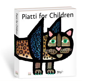
Managing director Riky Stock receives insight from prominent designers Steff Geissbuhler and Alison and Robert Probst in preparation for the publication of The Happy Owls and Piatti for Children by Swiss designer Celestino Piatti. Steff talks about growing up in Basel, Switzerland, where Piatti’s posters and designs colored the streets and storefronts. Piatti’s work, including his iconic and bold animal illustrations, influence Steff’s own designs to this day.
Steff Geissbuhler reflects on Piatti
From 1958 – 1962 Steff studied at the Basel School of Design, a time when Armin Hofmann, Herbert Leupin, and Celestino Piatti made their marks on Basel. When Steff was 25, he followed designer Ken Hiebert to teach at Philadelphia College of Art and in 1975 he joined the renowned New York design firm Chermayeff & Geismar Associates, where for 30 years as partner, he designed some of the world’s most memorable logos, including the NBC peacock.

Reminiscing, Steff told me “Living, studying and growing up in Basel was a very special time and place.” Armin Hofmann, Herbert Leupin, and Celestino Piatti were the local graphic design gods. They had a huge impact on the city. Their work was everywhere, on book covers, in bookshops, on the poster columns and walls.”

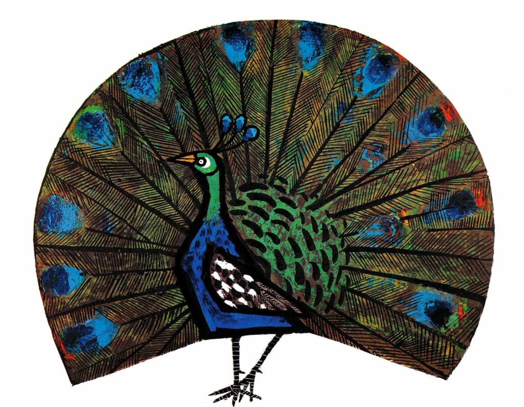
The NBC peacock logo designed by Steff Geissbuhler and Piatti’s peacock illustration from PIATTI FOR CHILDREN
Steff and his friends would collect these posters by “stealing” them. They peeled them off the walls, three posters at a time as they were attached (as only that would guarantee that the top one didn’t rip in the process). They would put the posters in a bathtub to separate them, then flattened and dried them. Steff owned a few Piatti posters. “I was very lucky to be in Basel at that moment in time.”
Steff recalls visiting Piatti who lived down the road from the cathedral, the “Basel Münster.” Piatti lived on the top floor of a narrow building, “way up, overlooking the Rhine River. He was not one of the starving artists at all. He was king, a fantastic looking guy with beard and pipe, an almost intimidating figure.” Piatti’s work was everywhere, striking, stark black lines framing his creations. He had a very distinct and distinguished visual language.
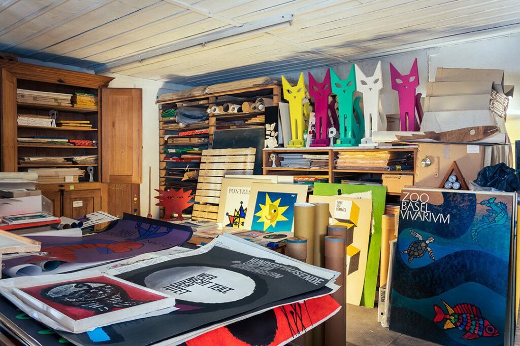
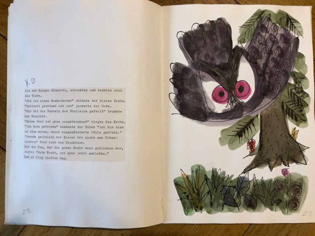
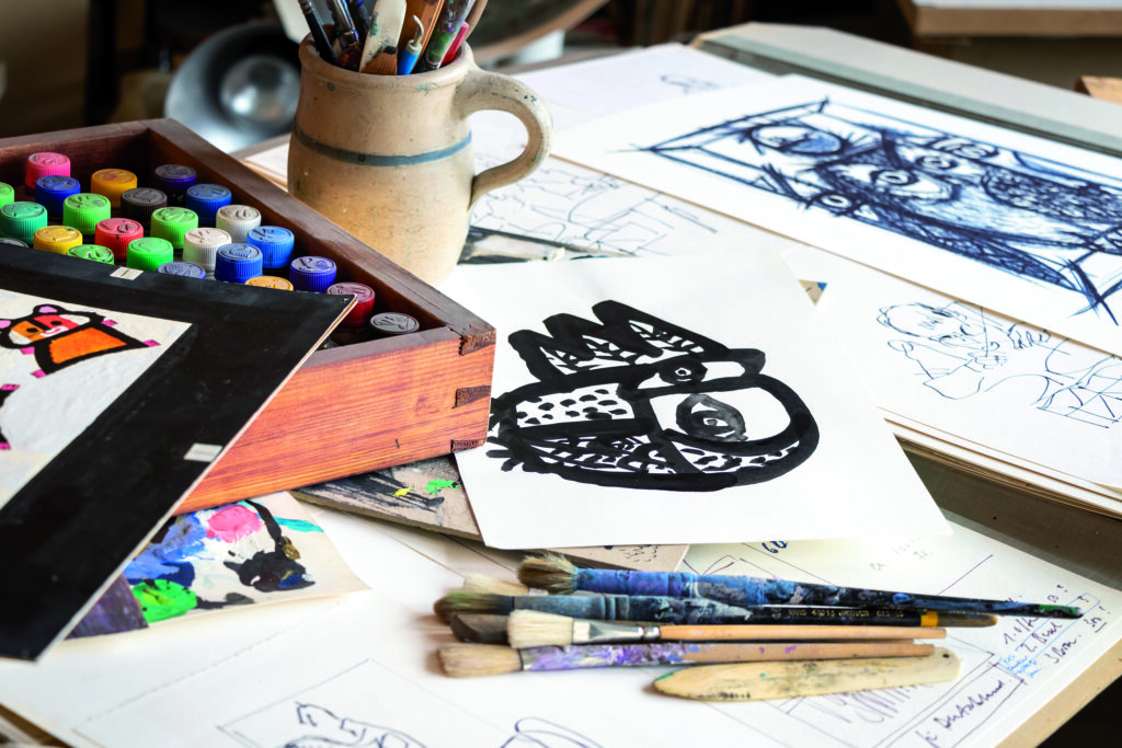
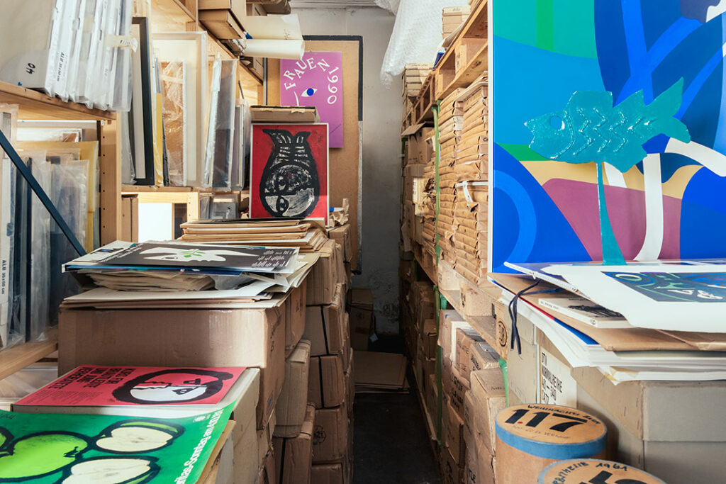
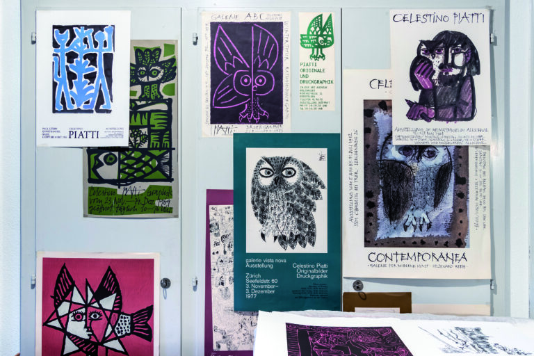
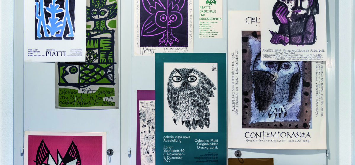
Images from the Piatti archive
Alison and Robert Probst reflect on Piatti
When I was in school in Münchenstein, I always loved my “Neues Schweizer Lesebuch, GEDICHTE” (New Swiss Reading Book, POEMS) with the cover designed by Piatti! I was fascinated by the seemingly spontaneous yet orderly air of the illustration as well as the Piatti signature full of vulnerability but with an assured self-awareness. I would stare at it and wonder…Just a few years later I was a student in Donald Brun’s graphic design class (Fachklasse) and was delighted to meet the illustrator himself when he would stop by to visit!
Alison Probst, Designer
Since early childhood I was drawing and painting. Growing up in the Basel region I was always mesmerized by the many wonderful, large-scale event and advertising posters, — even before I could read the signature of my favorite ‘PIATTI’.
Robert Probst, designer
Cover photo copyright: Basil Huwyler