Screen Printing and Special Colors
Interview with illustrator duo Golden Cosmos
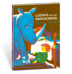
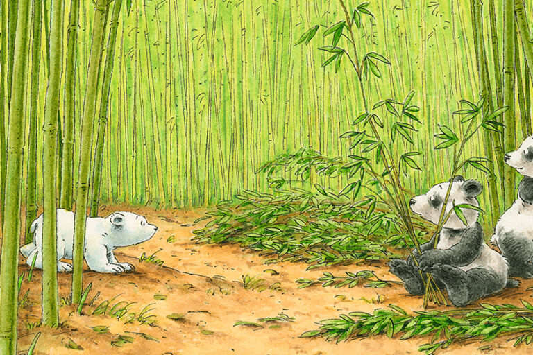
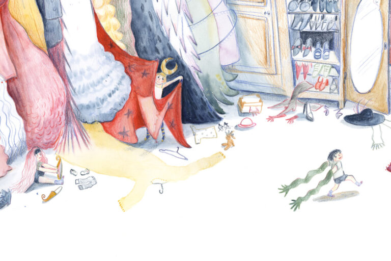
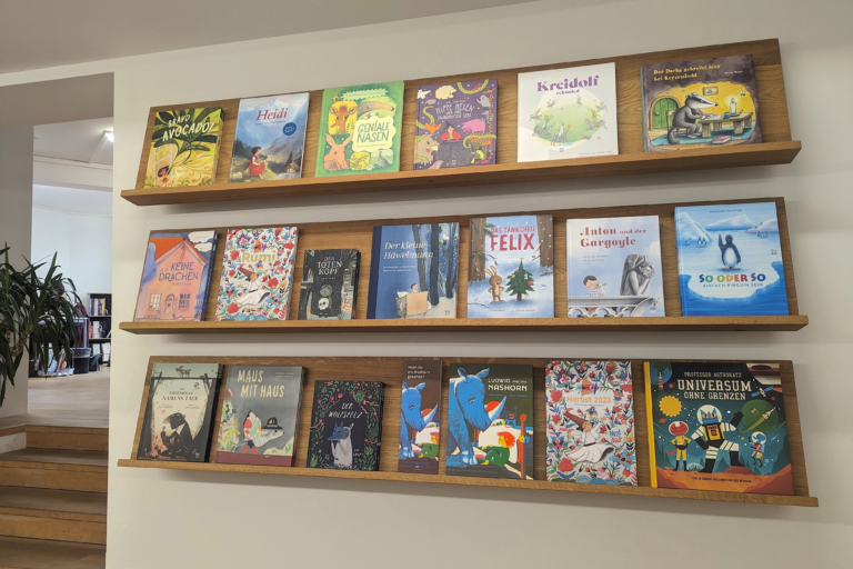
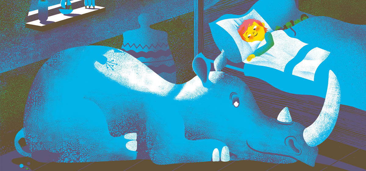
Ludwig is convinced that there’s a rhinoceros in his room. Impossible—according to his father! But can he prove it’s impossible? Ludwig and the Rhinoceros is a philosophical bedtime story written by Noemi Schneider. The book makes an immediate visual impact through the vividness of its illustrations. In order to achieve this for their debut picture book, the duo of illustrators GOLDEN COSMOS used special colors. This interview was conducted by NordSüd Verlag and translated into English by David Henry Wilson.
What’s the secret behind the special colors?
Normally when you go to the printer, they use four standard colors, which can be mixed into any new color you want. There are countless tiny dots that are printed over one another and can be mixed to form new shades. However, these mixed tones are not as bright and intense as a special color can be.
Why do you find them so attractive?
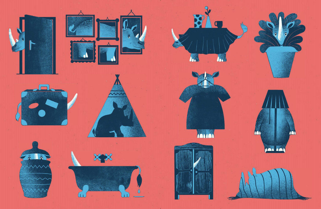
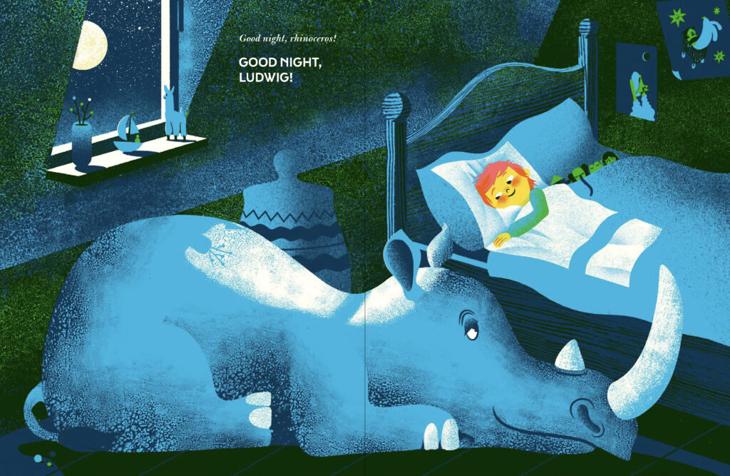
Generally our favorites are neon colors, which are particularly vivid and mix very well when they’re printed on top of one another. You can actually achieve a maximum range with just three basic ones. These special colors are very good for emphasizing something, creating focal points that direct viewers to different part of the picture—and maybe even make them feel a bit uncomfortable by changing their ways of seeing things. In Ludwig and the Rhinoceros, what we found particularly exciting was the contrast between all the dark mixed colors and the dazzling neon of Ludwig’s hair—you just can’t miss it! The whole story takes place in the semi-darkness of this twilight setting in which you might see something which isn’t actually there, or you might miss something that is there. You have room to use your imagination, and objects can take on a life of their own—nothing is ever quite tangible. And in the midst of all this darkness you have this shining redhead who is so sure of himself that nothing and no one can make him think differently.
Why do classic contrasts like red and green always work so well? And how do you use them to create special effects?
It’s these classic contrasts that open up the widest possible spectrum of colors. Red and green, black and white, hot and cold. It’s through opposites that you can create the maximum impact. Up and down, loud and soft, lots of color, and minimal color—this is how you can create dramatic effects within a single picture or in a sequence of pictures. You steer the viewer’s gaze, and you maintain the tension. A lot of it happens unconsciously—you produce a mood or an emotion. It’s always these strong contrasts that make the viewer focus on what is important. And where the pictures contain fewer contrasts, you will find narrative elements which continue the story in the background, adding something to it even if at first sight they may be overlooked and may only be discovered on a second or third viewing—for example, the pattern on Ludwig’s pajamas.

What role do light and shadow, the visible and the invisible, negatives and positives play in your illustrations?
For this story in particular, it was essential for us to make the illustrations atmospheric. And so it was clear right from the outset that there had to be a great deal of interplay between light and shadow. These define the objects and the space between them—they localize things and create a rhythm within the picture. The rhinoceros in semi-darkness, in shadow, stands for something intangible and imaginary, whereas Ludwig with the exuberant energy of childhood stands for the light and clarity of something real. The two together produce a kind of tension.
What do you find particularly attractive about the aesthetics of screen-printing? What’s the special appeal of this style, which is often used in advertisements and on posters?
It’s the clarity of forms and colors that’s so appealing. And with screen-printing there are only two options: you print or you don’t print. The screen lets the colors through in particular places and keeps them out elsewhere. There are no halftones: if you want those, you need to find a graphic method. This could be a computer-generated grid, but what we find more satisfying is graphic grids, hatching and cross-hatching, tightening and loosening.
In screen-printing, the colors can be either opaque or transparent, and you can use both these qualities to create special mixtures and effects. The sequence of the printing also plays a role. For example, if you print the neon red of Ludwig’s hair on top of the blue, you’ll get a different effect from printing the blue on top of the red. If you then print the yellow on top of them both, it’ll look quite crazy! Experimenting with colors is always great fun. The nicest moment of all is when one color is printed on top of another, and even though we’ve designed the pictures ourselves, we’re always in suspense waiting to see if the different parts will blend into the whole that we’re looking for.
With screen printing there are only two options: you print or you don’t print.
GOLDEN COSMOS
We prefer to work with shiny transparent colors and to apply them to completely plain surfaces—that is to say surfaces without grids. This is the best surface on which to print colors on top of one another and mix them into new colors, which will blend harmoniously with one another. The limited number of colors gives the pictures a formal discipline and unity, which also creates a link between our sometimes very different styles.
You also work a lot in other media, such as magazines and journals. What attracted you to the idea of illustrating a picture book? And what adjustments did you have to make?
In some respects, media are more of a sprint and books are more of a marathon. We have very little time to create the pictures for magazines and journals, and they’re based on a specific, concrete subject, which demands absolute precision of content as well as having to be ready by a fixed date. You’re often given just a few hours to formulate your ideas, and then there are one or more art directors who may select from these or may even want to specify the content. It’s always a sprint. You must work at top speed, and have little or no chance to experiment with new ideas, but on the other hand you soon get a result, immediate publication and, with a bit of luck, success! Also the subjects we’re asked to deal with are often very stimulating and we learn a lot from them.
Conversely, working on a series of illustrations for a book is a marathon. You need a lot of perseverance, but you do have more time to develop the story, the plot and the characters, and to create something of greater depth. It’s also different designing a sequence of motifs. You’re not forced to compress the whole thing into a single picture—it’s only through the accumulation of pictures that you create the whole. It’s exciting simply to turn the pages of a book. Time passes. There’s a before and an after, a question and an answer. And you can play wonderful games with this process.
And last but not least, there’s the permanent tangibility of the book. A lot of our work is published either online or in a very short-lived printed medium. Then it disappears forever. It gives us a lovely warm feeling to know that our book will stand on bookshelves and in children’s rooms, and maybe even 30 years later someone will smile with pleasure at the memory of the books they read when they were young, just as we do ourselves. Picture books and stories are something special for children, and some make their mark permanently. It’s simply wonderful to think that we might also play a small part in the process.